 Rachel Begg
 Landing pages, also known as Lead Capture Pages, Splash Pages, or even Squeeze Pages, are a crucial part of your website and an inbound marketing strategy. They guide visitors from your website through a process to help them with a solution or advertisement and ultimately increase the lead generation via your website.
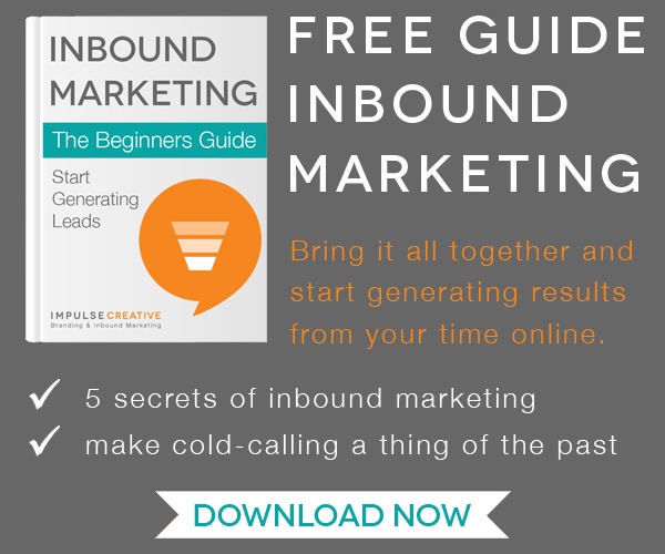
One of the first steps needed for lead generation happens when a customer comes to your website: They should be attracted to a delicious Call-To-Action (CTA).
Statistics show that in order to increase your ability to generate more leads, you will need at least 30 landing pages on your website. I know that may sound like a lot, but when you think about it you should be blogging at LEAST once a week and each blog post should have their own CTA that leads you to a dedicated landing page. Don’t freak out yet, because not all blogs need to have a different CTA. But there needs to be at least one CTA on every single page of your website, so when you think about the smaller websites it shouldn’t be that hard to reach the 30 landing page goal.
Now, you are probably wondering why they are like burgers... don’t worry, I will explain. While watching a webinar on creating the perfect landing page, our friends over at Hubspot say it is not just a landing page that you need to think about. You need to think of the process as “bookends on either side of your landing page.” You must have an attractive CTA, a Landing page, then a Thank You Page. Maybe it was because I hadn’t eaten lunch yet, but it totally dawned on me that it sounded like a burger. It actually made sense the more I thought about it.
Think about it… You go to a website and you see a Call-To-Action that is ugly and/or blends in on the page or has unreadable text so you can’t read it – you probably aren’t going to click on it – this represents the generic, stale bun. Then you go to another website and it has a bright blue CTA with legible words and it sticks out on the page – this would be a delicious Brioche Burger Bun that has been toasted and is so yummy. Hmm let me think… heck yes, I am going to want to eat the Brioche bun!
To make a delicious CTA you need to focus on the placement on your website, it needs to pop or have a contrasting color, showcase a value or incentive for clicking on it, and be clear and concise.
Then it comes to the middle of the burger, you aren’t going to want to eat a flavorless frozen patty of mystery meat. You are going to want to eat the fresh Angus Beef that is juicy and perfectly cooked. Essentially, you need to make sure that your landing page has all of the right components; such as brief content, a lead form, and value or incentive as to why they need this information or solution to attract the visitor to actually download the whitepaper or checklist.
The goal of a landing page is to get prospects to fill out their information so that you can nurture them into a customer. To make a juicy landing page you need to remove all visual clutter, including the website navigation so that the visitor does not get distracted, you will also need to make sure that the landing page has a brief description of the whitepaper or checklist, use contrasting colors and formatting so that it is grabbing their attention and they will want to fill out the form and get their prize. Need that extra nudge? Testimonials are also a good way to encourage the visitor to fill out the form. Will you be more likely to go to a burger place if it has raving reviews or reading about the burger joint telling you they’re the best?
Ok, so back to the food…
So once you have that brioche bun, and perfectly cooked angus beef patty, you absolutely need the bottom half of the bun. Just like a burger is not complete with the bottom half of the bun, a landing page is not complete without a Thank You Page. The Thank you page is really important because once the visitor has filled out their information you will have to provide them what you have promised, give them the link to download. But in addition to thanking them for filling out the form and providing their link to download, you want to make sure to include social sharing or follow buttons. We all know how viral things can get once they are put on Facebook, Twitter, LinkedIn, Pinterest, etc… Make it easy for the visitor to share it with their friends and duh, more leads! In addition, why not try putting another CTA on the thank you page, but make sure it also looks delicious and nurtures your lead down the funnel!
So now that you are craving a juicy angus burger patty on a perfectly toasted brioche bun, make sure that you remember all of the perfect ingredients for the trio of a landing page. (1) Call-To-Action leads to (2) Landing Page leads to (3) Thank You Page.