 Remington Begg
Reinventing a Brand
In the cutthroat world of B2B services, it’s fast, smart and simple solutions that rule the land. That’s exactly what our client COGENCY GLOBAL provides for businesses around the world. So when their outdated and difficult-to-use website created a disconnect in their marketing, we were there to help.
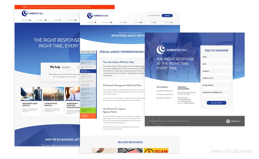
As COGENCY GLOBAL rebranded their company, Impulse Creative used their new logo, created by another firm, to build a foundation for the brand’s entire marketing structure. This top-to bottom website redesign relies on smart content and responsive functionality to embody the client’s mission: “The Right Response, at the Right Time, Every Time.”
The Problem
Since their last redesign in 2010, our client’s online presence had bloated to 300+ long pages, written and created for a brand that didn’t reflect who they were anymore. This complicated brochureware site was no longer a profit center, and didn’t quickly address customer needs.
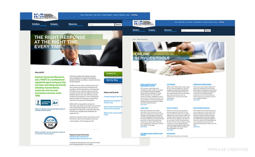 Not only was it difficult to navigate through their large product portfolio, but when users found what they were looking for, long pages full of insider language made it difficult to understand exactly what each product was.
As a result, their conversion rates were suffering, ultimately hurting their bottom line.
In this case, the best choice the client had was to hire outsiders to put themselves into the buyer’s journey and rethink the website impartially. That helped to focus on pain points and user experience, without the temptation to clog the site with unnecessary details.
This project was big and it’s problems were comprehensive. So, Impulse Creative focused on streamlining and simplifying with a new, rebranded website that used recrafted messaging and smart tools to improve lead-flow.
The Process
The best way to start cooking up anything new is by taking a look at your ingredients with a content audit. Poor URL mapping, an ineffective site map, more than 375 non-blog pages and duplicate content were hurting their SEO rankings.
We began by deleting all of that duplicate content to make sure the new site rose to the top of search results. That content audit also gave us a clearer picture of the what we needed to create and design.
Wireframes were the next step, to define information hierarchy, plan layouts, map a more efficient navigation flow and create functionality based on how we wanted users to process the information.
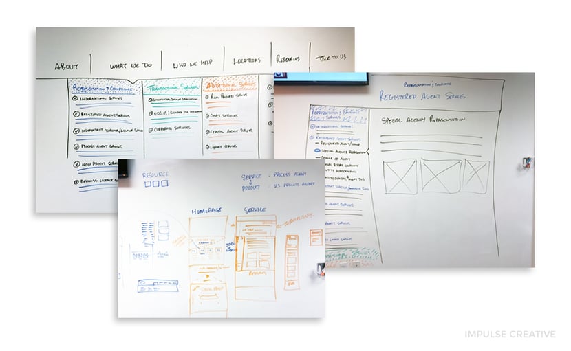 We started simply by mapping out user navigation on our gigantic whiteboards, then sketching how functionality would work with each of the Hubspot apps: HubSpot COS, HubDB, Smart Content, Hubspot’s Advanced Menus and HubSpot Blogs.
 By leveraging Hubspot COS for the site, we gave our client a tool for easy content editing when our work was done. The fulfilled our promise to ensure the client was empowered to change their website when they needed to, preventing it from ever hurting their business down the road.
Once we decided to utilize the HubSpot COS Menu Tool for ease of future editing, we manipulated the menu structure to easily style it as needed. Creating an intricate navigation in multiple places, including the sidebar, allowed the user to get where they needed to in three clicks or less, no matter where they were.
Modules for smart content were built into our functionality plan for delivering pages with one of our favorite tools, HubDB.
“One of the unique challenges with the project was integrating all the different elements and perspectives of the clients project to intermingle as a mesh of content,” said Remington Begg, CRO of Impulse Creative. “The content, sitemap strategy, and the objective of the website was really to understand where you ‘were’ in the website at any given moment.”
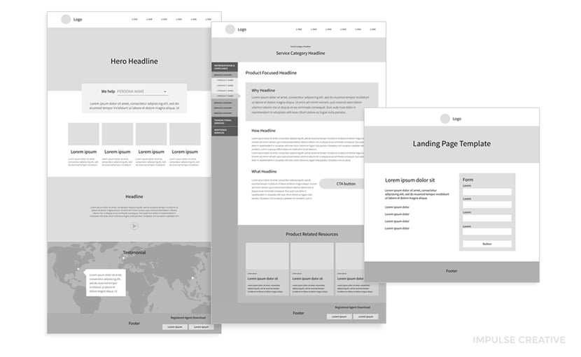
Style tiles provided an early opportunity to explore how the client’s new brand colors would interact with such design elements as buttons and photography. We used these to translate the brand’s visual assets (logo, color, fonts) into a digital format. Finally, we created high fidelity design comps based on wireframe and style tile feedback for quick approvals with very few edits.
As the site’s design came into focus, our content team got to work creating an entirely new brand voice. The first step of this process was working with the client to create an 18-page Editorial Style Guide to develop a new tone of voice (TOV) with defined content creation processes. Not only did the guide serve as an outline for website content creation, it set their marketing team up for future success by clearly explaining how to recreate the new brand tov.
Our next challenge was to recraft 109 pages of content to support the buyer’s journey in the new conversational but professional TOV. We started content creation by surveying 13 subject matter experts (SME), COGENCY GLOBAL Product Managers.
When responses started rolling in, it didn’t take long to realize written information needed to be supplemented with interviews. Going over the survey information with the client helped to identify individual product goals, outdated or missing information, common buyer concerns, competitive advantages and the little details that helped us to craft a story on every page.
With every SME meeting, the site map changed, causing our whole team to adapt daily. Pages were constantly being merged, added, and deleted, as we helped product managers think critically about their department’s online goals, their customer’s pain points and the buyer’s journey.
Due to their inbound campaigns, site complexity and outdated information, there were more unforeseen considerations than we had ever planned for. Our team responded by coming together for constant collaboration and functionality problem solving. We reined in these changes by having project managers sit in on every meeting to catch action items and distribute them to the right team members.
When writing began, the Golden Circle helped us to organize the content, design page templates and focus on the buyer’s journey. Not only did it organize information into easily-understood pieces, this template approach streamlined our content creation process, allowing us to write 109 pages of unique content in about a month.
As the content started to flow, development kicked into high gear, using HubDB to turn design elements into interactive resources. With the same program, we developed buyer persona tools and logic that allowed us to feature smart content on nearly every page, based specifically on the known needs of the user.
The Product
Our client’s success is built on providing the most responsive service in their industry: giving customers exactly what they need, when they need it. So we created responsive solutions to showcase persona-based smart content and relevant blogs.
Throughout this project, we leveraged the buyer’s journey and inbound funnel to build a foundation for the client’s online success and fuel the marketing department’s inbound efforts:
- A redesigned sitemap drastically improved user experience.
- Editable elements in the website’s main navigation allowed us to explain what each menu item was in the drop down navigation using HubDB and jquery.
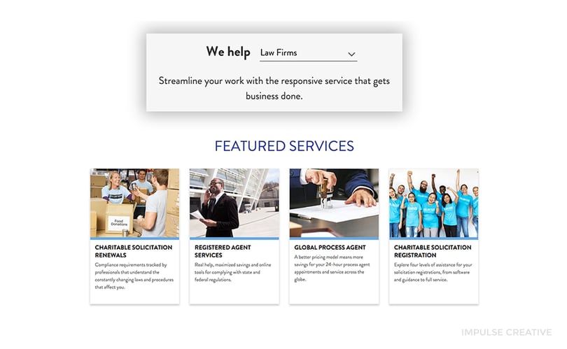
- Featured service card elements on various layouts (including the homepage) cater recommended services to four different buyer personas.
- A homepage persona selector allows the user to customize content while storing and submitting user data via a cookie as soon as they submit a form on the site.
- Multiple conversion options on each website service page (including a form on most bottom-level pages) make it easy for users to reach the bottom of the Inbound Funnel as soon as they’re ready.
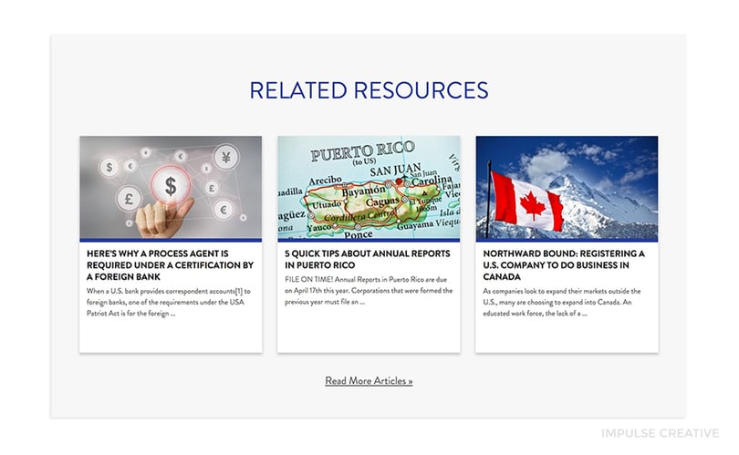
- The client’s vast library of blogs and content offers are now hosted as Related Resources on bottom of each service page, automatically pulled from HubDB with customized sorting by topic.
- Site-wide integration with the client’s service apps provides logged-in users with a seamless experience and premium content.
- Ditching duplicate content for 109 unique new pages with original videos is now helping COGENCY GLOBAL to rise in search engine rankings, which will lead to a rise in revenue and business growth.
- Revamped content makes it easy to find and understand COGENCY GLOBAL’s products and services.
- Every service now has it’s own strategic focus, with a cohesive design and tone that embodies the new brand.
The Impact
Today, visitors to COGENCY GLOBAL's website get a customized B2B consumer experience and persona-base smart content that matches the client’s new brand both contextually and visually. They get anywhere on the site in under 3 clicks, with multiple opportunities to convert, no matter where they are.
Our client is now better serving their customers, and their sales department, by easily updating their own content in the Hubspot platform as their locations and product offerings expand.
Contact Impulse Creative to make your website
our next remarkable project.